Stir Q&A: Jag Nagra's vibrant mask design helps scare off the year's bad energy at LunarFest's Lantern City
The illustrator whose Diwali hockey jersey went viral talks Nazar Battu masks, submarine sandwiches, and her new appreciation for bright pink
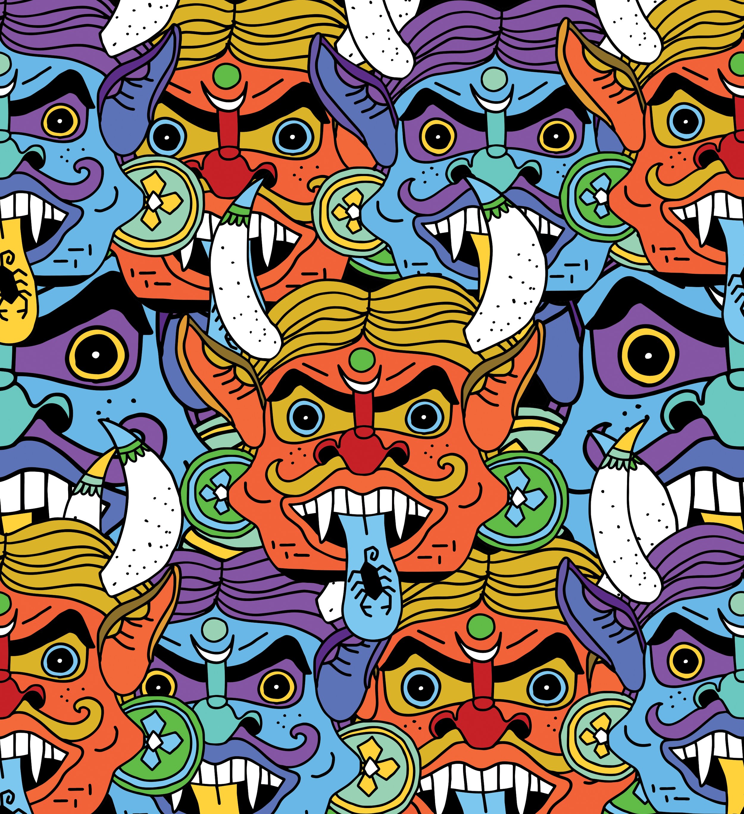
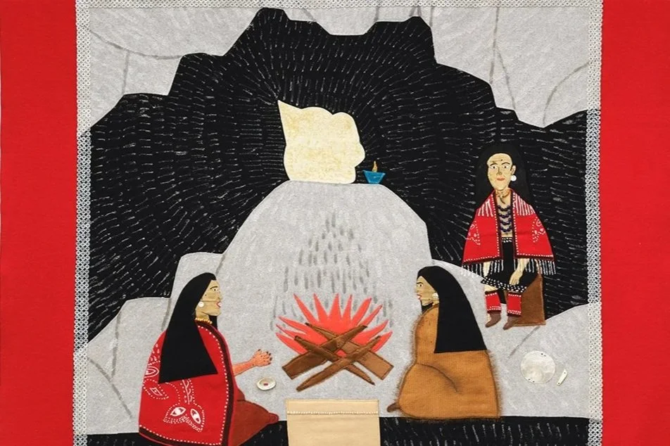
“These masks are placed outside of homes to ward off the evil eye in India and other South Asian countries,” Jag Nagra explains of her Nazar Battu lantern design.
LunarFest presents the Lantern City at šxwƛ’ənəq Xwtl'e7énḵ Square, North of the Vancouver Art Gallery, from January 27 to February 9, and Ocean Art Works on Granville Island from January 29 to February 21
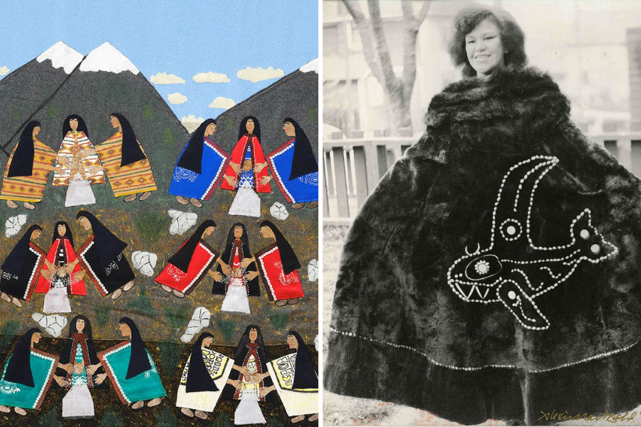
JAG NAGRA’s Diwali-inspired designs for the Vancouver Canucks’ warmup jerseys went viral last November, when actor-potter-pot-enthusiast Seth Rogen offered to trade one of his vases for the bold yellow shirt.
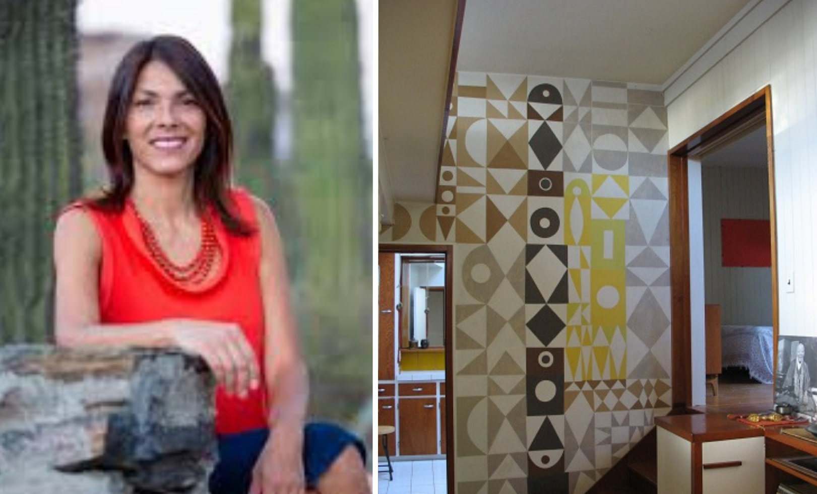
Nagra, a self-taught illustrator, has worked across a wild range of media, from fabric banners to, now, a bright, towering new lantern for LunarFest. The Lantern City is showing her work amid a multicultural mix at šxwƛ’ənəq Xwtl'e7énḵ Square, north of the Vancouver Art Gallery. The display gets glowing tonight, and runs all the way to February 9.
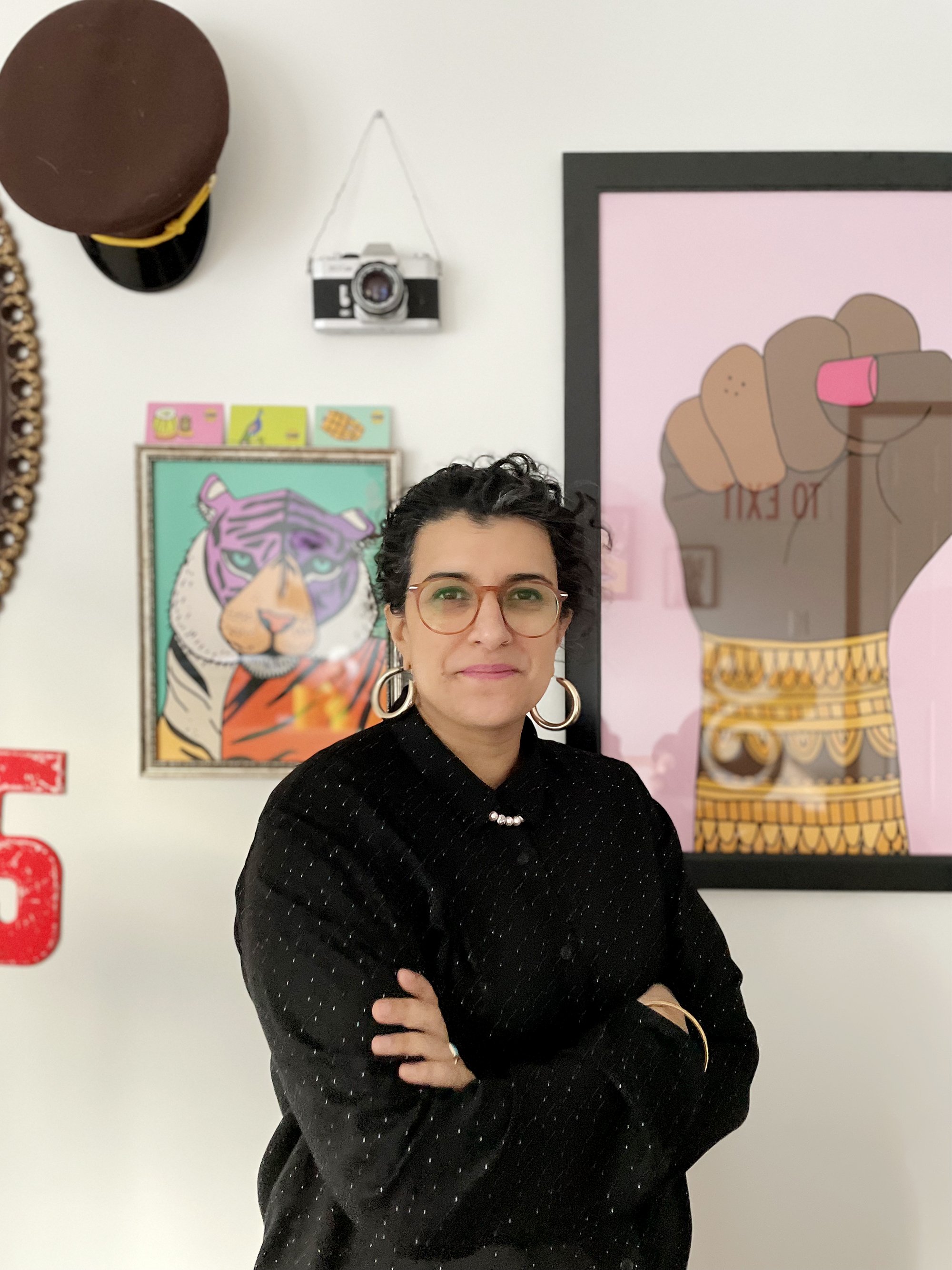
Stir talked to Nagra (who’s also creative director at the Punjabi Market Collective) about the inspiration for her mask-based design, called Nazar Battu, her passion for inclusion, and her newfound love of the colour pink.
You've worked across media from street banners to hockey shirts. What makes working with a giant lantern different?
This Nazar Battu artwork was already something that I had in my portfolio, actually, so it was just a matter of sizing it correctly to fit the lantern template. But to be able to see it in a 3-D space, several metres tall, that’s what I’m excited about. And the fact that it’s going to live outdoors so the public can come up to it, interact with the outdoor space it’ll live it, and interpret it however they do… I love when art is accessible to anybody and everybody.
Nazar Battu are masks said to ward off evil spirits. Why are you drawn to that imagery, and what's with the scorpions on their tongues?
The last time I travelled to India in 2008, I noticed all sorts of objects people would place around their homes, in their vehicles or trucks to help ward off the evil eye and to keep them safe. Things like Nimbu-Mirchi, which is a combination of seven chilis and a lemon strung together and hung outside a home or place of work. Or a single shoe hung on the front of the ubiquitous ornately-decorated truck. I became fascinated with them. Then a few years ago, my friend and fellow board member of the Punjabi Market Collective, Navi Rai, asked me if I’d ever drawn a Nazar Battu mask. I hadn’t, so I did. These masks are placed outside of homes to ward off the evil eye in India and other South Asian countries. They’re quite scary and unsettling to look at, and their job is to create a blemish on something otherwise perfect, and to scare off the evil eye. The scorpion is an extension of that—something scary. And honestly, after the last few years we’ve had, I think we could all benefit from shedding the bad energy around us.
You've worked hard to end the stigma around the queer members of the South Asian community. With The Lantern City theme "We Are a Family", does your lantern speak to inclusivity too?
With this piece, I wouldn’t say it’s necessarily related to my advocacy work in the queer community, but sometimes my advocacy comes just from being an openly queer person. If someone closeted, especially in the South Asian community, can see someone like me, doing things publicly, living openly, sometimes that alone can make a huge difference. I don’t hide who I am, nor the fact that I’m married to a woman and that we have a family together. It’s the representation that matters. If my being visible can make someone out there feel comfortable with themselves, that’s huge. The Lantern City theme of “We Are a Family” is powerful. We may all come from different walks of life, have different life experiences, but we’re all in this together. And for me, I try to remind people that as a queer person, I'm just like everyone else.
Why do you think you're so drawn to brights and what's the blast of colour you find yourself grabbing for the most?
The vibrancy in colours that I use is a direct contrast to the grey rainy weather here. I tend to suffer from seasonal affective disorder and as a result, my art and home is full of bright colours to help me offset that. I love adding pops of pink to my art usually. Growing up, I was very much a tomboy and rejected stereotypical standards of femininity somewhat subconsciously. But our three-year-old daughter is obsessed with pink. If it were up to her, every wall in our house would be pink. And as much as I avoided that colour all my life, seeing it through her eyes, now I’m like, “This is actually an incredibly beautiful colour!"
Is your motto "Subway Sandwich ArtistTM turned 'Artist' Artist" meant to be a beacon of hope to aspiring artists slogging it out at fast food chains, or does it keep you grounded for times when, say, your Canucks warmup jersey designs go viral?
When I worked at Subway close to two decades ago, I remember getting my branded polo shirt and seeing “Sandwich Artist” embroidered on the sleeve. I wasn’t even in art school at the time, but I found it kind of charming. If I’m remembering correctly, I think that was my very first real job. Flash forward to my journey through graphic design and art, it’s a funny little reminder that even before I became a professional artist, I was an artist of the sandwich variety. ![]()

Related Articles